The Myth That Every Colour Has One Meaning
Colour has no fixed meaning in a painting: learn to read neighbouring hues, placement and context to see how an artist shapes your impression.
The common mistake is to treat a colour as a code: red means passion, blue means calm, yellow means joy. That shortcut can make you miss what the painting actually does, because a colour’s impression shifts with its neighbours, position and subject. To read colour in art, look at the relationships before assigning a symbol.
Does a colour have one meaning in art?
No single meaning belongs to a colour in every artwork. Red may suggest warmth in one passage, danger in another, or simply make a small shape stand out against a subdued ground. Its role depends on what surrounds it and how the artist has arranged the whole image.
Colour associations do exist. People may connect particular hues with ceremonies, flags, seasons, faiths or familiar objects, and those associations can matter when they are relevant to the work. But they are starting points for looking, not a dictionary that settles interpretation in advance.
Separate the observable choice from the meaning you infer. You can say, “A bright red patch sits near the edge, beside a dull green area,” before proposing that it feels urgent or inviting. That order keeps your reading anchored in the painting rather than in a general slogan about red.
Why does a colour change beside another colour?
A colour is perceived in relation to its surroundings. Place the same-looking grey beside a deep violet and then beside a pale yellow, and it may seem to lean warmer or cooler, even if the paint itself has not changed. The contrast between neighbouring areas helps shape what each one appears to be.
Artists can use this effect to create tension or harmony without changing the basic subject. A muted green beside a vivid pink may feel sharper than the green does next to a group of similar greens. A narrow strip of orange can make a broad blue passage seem cooler by comparison.
When looking, compare a colour with the patch immediately beside it, then with the larger field around it. Ask whether the edge is crisp or softened, whether the colours are close in brightness, and whether one is more saturated. These relationships often explain an impression better than a symbolic label does.
Try covering the rest of the image with your hands or a sheet of paper, leaving two neighbouring areas visible. Notice what changes when you uncover the full work: the local contrast remains, but the larger composition may give it a different role.
How does placement affect a colour’s impression?
Placement gives colour a job within the composition. A small, vivid mark near the centre can attract attention; the same mark near an edge may pull the eye outward or balance a larger area on the opposite side. Its importance is not determined by hue alone.
Consider where a colour appears in relation to faces, hands, objects, empty space and the picture’s borders. If a repeated hue links separate forms, it can guide the eye between them. If it appears only once, that isolation may make it feel emphatic, strange or deliberately disruptive.
Scale matters as well. A pale colour filling most of the canvas can dominate through area, while a dark accent can command attention through contrast. Neither effect proves a particular emotion; instead, each changes the order in which a viewer is likely to notice things.
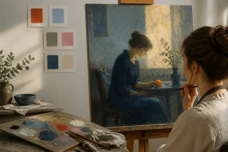
Imagine a painting with a broad, quiet field of blue and one small orange shape near a figure’s hand. The orange may draw your gaze to the gesture, while its size and isolation make it feel unusually insistent. If the same orange were repeated across the background, it might become part of a pattern rather than a focal interruption.
Can the subject alter what a colour suggests?
Yes. A colour’s association changes with what it colours and what is happening in the scene. Blue on a garment, blue in a sky and blue on a bruise do not invite identical readings, even when their visible hue is similar.
Look at the object first, then consider the colour choice. Does the colour match ordinary observation, depart from it, or blur the distinction between forms? An unexpected colour may be expressive, symbolic, decorative or a way to organise the image; the surrounding evidence helps distinguish among those possibilities.
Context also includes the work’s internal story. A warm red around a threatening event may feel unsettling rather than comforting, while a pale blue used for a familiar household object may appear cool, distant or simply unusual. The scene can complicate an association instead of confirming it.
Be cautious about treating a colour choice as a direct report of the artist’s feelings or intentions. The painting can support a claim about what the colour does in the image without providing enough evidence to say exactly why the artist chose it.
How can you tell whether colour is symbolic or formal?
Often, you cannot separate those roles neatly. A colour can help balance the composition and carry an association at the same time. Instead of forcing a choice, ask what evidence supports each reading and whether both can be true.
Start with formal evidence you can point to: repetition, contrast, placement, brightness, saturation and the way colour defines or disrupts a shape. Then ask whether the subject, setting or other visible details support a symbolic interpretation. A claim is stronger when it explains several features rather than resting on one hue.
For example, if a particular colour appears on a meaningful object and returns elsewhere in the image, its repetition may connect the object to another passage. If it appears only once but creates a strong visual balance, its compositional role may be easier to establish than any symbolic one. Both readings remain possibilities until the work offers more clues.
Keep your wording proportionate to the evidence. “The red seems to intensify the scene” is a useful observation; “red always represents anger” is a rule the painting cannot establish. Art appreciation becomes clearer when interpretations remain open to what is actually visible.
What should you ask when reading colour in a painting?
What is the colour beside?
Name the neighbouring hues and compare their brightness and intensity. This reveals whether contrast, rather than a fixed association, is making the colour feel prominent, subdued or altered.
Where does the colour appear?
Notice whether it sits at the centre, near an edge, on a figure or across a large area. Its position can steer attention, connect separate forms or interrupt a visual rhythm.
Does the colour repeat?
Look for the same hue in other objects or passages, including subtle variations. Repetition may create a visual link or pattern, while a solitary use may make the colour stand apart.
What does the subject add?
Identify what the colour is applied to and what is happening around it. A familiar association may be reinforced, complicated or made irrelevant by the scene.
How can you describe a colour without overclaiming?
Use a sequence that moves from observation to interpretation. First name the colour as specifically as you can: not just “blue”, but perhaps a pale, greyed blue. Then describe its neighbours, location and recurrence before saying what impression those choices create.
Separate “it looks” from “it means”. “The yellow looks unusually bright against the dark brown” describes a visible relationship. “The yellow makes the room feel lively” offers an interpretation that a reader can consider, question or refine.
If your first reaction is a familiar symbol, test it against the painting. Does the colour appear in a place that supports that association? Do other colours reinforce it, or push in another direction? Could the composition explain the choice without a symbolic meaning?
When you read colour in art this way, you do not need to abandon cultural associations. You simply give the artwork more room to complicate them. A colour is most revealing not as a word in a fixed code, but as a decision made in relation to everything around it.
Next time a familiar hue seems to announce a clear message, look first at its nearest edge and then at the whole canvas. The gap between those two views is often where the painting’s most interesting colour choices begin.