How a Picture Frame Changes the Way You See an Artwork
Learn how a picture frame shapes attention, spacing and contrast, then make a clearer choice about mounts, finishes and visual weight for your artwork.
The most common picture-frame mistake is choosing a moulding because it looks attractive on its own. That can leave the artwork feeling cramped, overshadowed or disconnected from the wall; judge the frame by what it does to the image.
A picture frame sets the image’s boundary
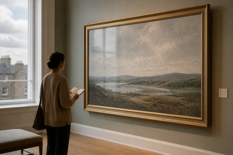
A frame can hold a panel or canvas, cover an uneven edge and separate an artwork from the wall. It also marks where the depicted space ends and the room begins, so its width, colour and finish affect how you approach the image.
A deep, dark moulding can make a work feel enclosed, while a narrow, pale edge may keep it visually close to the wall. For work on paper, a mount can add breathing room; a tight edge can make marks near the border feel more immediate.
Decide whether the frame should contain the image quietly, echo a feature within it or create a deliberate contrast with the room. The answer depends on the artwork’s edge and visual structure, not on a rule that every frame should disappear.
Identify what the picture frame is doing
When a frame feels wrong, name the conflict before changing it. The edge may attract attention first, press too close to the image or introduce a style that seems unrelated.
- The frame attracts attention first. Check whether its profile, shine or colour is more prominent than the artwork. If so, compare a simpler or less reflective sample; if the frame is already quiet, look instead at whether the artwork’s contrast is too subdued for its setting.
- The picture looks cramped. Check whether important marks sit close to the edge. If they do, test a wider mount or more open presentation; if the composition runs to the edge by design, keep it unmounted and consider a slimmer frame.
- The frame seems unrelated. Check whether its ornament or colour has a counterpart in the image. If none is apparent, try a plain moulding; if a feature does connect, compare a restrained echo of it rather than a literal match.
- The whole object feels too heavy. Check whether the frame’s visual weight exceeds the artwork’s strongest forms. If it does, try a narrower or lighter-looking profile; if the artwork has substantial dark shapes, retain weight but test a less dominant finish.
- The image disappears against the wall. Check whether the frame and wall have similar tones. If their boundary is hard to see, compare a sample with clearer contrast; if the edge already stands out, choose a quieter tone rather than adding more contrast.
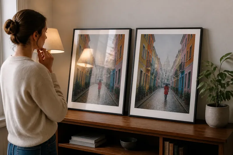
- Reflections interrupt the image. Check whether room light glints across the glazing or finish from the normal viewing position. If it does, ask a framer about a less reflective option; if no glare is visible, assess the moulding’s colour and profile instead.
Change one feature at a time so you can see which adjustment improves the relationship.
Assess the picture frame in a deliberate order
Begin with the artwork rather than the frame’s attractiveness. Notice where your eye lands, where it moves next and whether the edge supports or interrupts that movement.
- Inspect the image boundary. Look for figures, marks or colour areas close to the edge. If they seem pressed against the frame, test a mount or a more restrained profile; if the image is designed to run to its edge, avoid a mount that cuts into its visual effect.
- Compare visual weight. Set a frame sample beside the artwork and compare its prominence with the image’s darkest or boldest forms. If the sample dominates, try a slimmer or less contrasting option; if it disappears, test a clearer but still restrained boundary.
- Check finish and reflections. View the sample under the light in the room where the work will hang. If a glossy surface catches distracting glare, compare a less reflective finish; if reflections are not an issue, choose based on how the finish relates to the image.
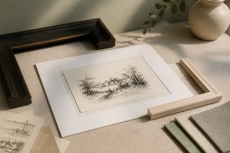
- Test the mount and spacing. Place a paper border around the work without covering any marks. If the added space clarifies the image, consider a mount; if it weakens an edge-to-edge composition, leave the artwork closer to the frame.
- View the complete arrangement in the room. Hold or prop the sample beside the artwork at its intended wall. If the frame looks detached or overpowering from the usual viewing position, adjust its tone or profile; if it supports the image there, inspect the details close up before deciding.
Say you have a small ink drawing with fine marks near its edges in a broad, dark frame. For this invented situation, you place a pale paper border around the drawing and compare it with a narrower moulding sample, without covering any marks; if the marks become easier to follow and the frame draws less attention, the narrower, lighter presentation is the stronger option, while a cramped or weakened image would point you back to a tighter border.
What should you check before choosing a picture frame?
Should the frame match a colour in the artwork?
It can, but an exact match may make the frame conspicuous. Compare its warmth or lightness with the artwork instead, and choose a related tone if that supports the image without copying a vivid accent.
Does every artwork need a mount?
No. A mount can separate work on paper from the frame and give marks near the edge more room, but it can disrupt a composition intended to run to the border. Let the artwork’s edge decide.
How do you judge a frame against a coloured wall?
View the artwork and frame against the wall where they will hang, since the surrounding colour affects how the frame reads. If their boundary disappears, compare a clearer contrast; if it shouts, try a quieter tone.
Can a frame change how large an artwork feels?
Yes. A broad surround can give a small image more visual space and formality, while a narrow edge keeps attention close to it. Choose the effect that supports the artwork’s composition.
Use the frame to clarify the viewing experience
A picture frame can preserve an edge, create a pause before the image begins or draw attention towards particular forms. A quiet surround may suit a crowded composition; a stronger boundary can help an open or pale image stand apart from its setting.
When you assess a picture frame, ask what the edge makes your eye do, then adjust its weight, spacing or finish accordingly. That simple question keeps the choice grounded in the artwork and helps you decide whether the frame should recede or remain visibly part of the experience.