Matte or Gloss: Two Ways a Printed Image Meets Light
Matte or gloss affects how a print reads in its room. Compare reflections, image tones and viewing positions to choose a surface that suits the work.
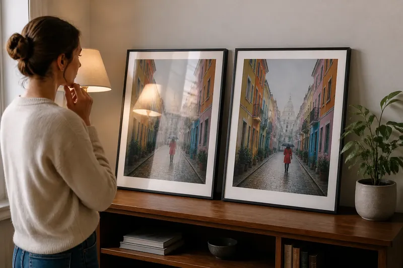
The common mistake with matte or gloss is choosing by touch alone: a print feels pleasing in the shop, then reflections or softened detail make it harder to view where it will hang. Matte or gloss is a decision about how light meets the image, and that choice affects which parts of the picture hold your attention.
Look at the print under the light it will actually face, then consider what you want to notice first. Compare the surfaces against the image, room and viewing position rather than treating either finish as universally best.
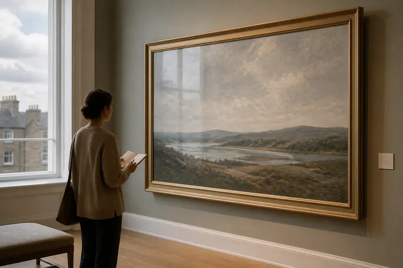
Matte scatters reflections while gloss returns them
A matte surface diffuses light rather than sending a clear reflection towards the viewer. That usually makes the image easier to see from different positions, especially when windows or lamps sit nearby. The trade-off is that the surface can look less saturated or crisp than its glossy counterpart.
Gloss reflects light more directly. In a controlled viewing spot, that can give dark tones depth and make colour appear vivid, but a bright reflection can sit over the image and compete with its details.
Stand where you expect to view the print, then shift a little to either side. Notice whether you see the picture or the room reflected in it.
Matte supports quiet tones and subtle transitions
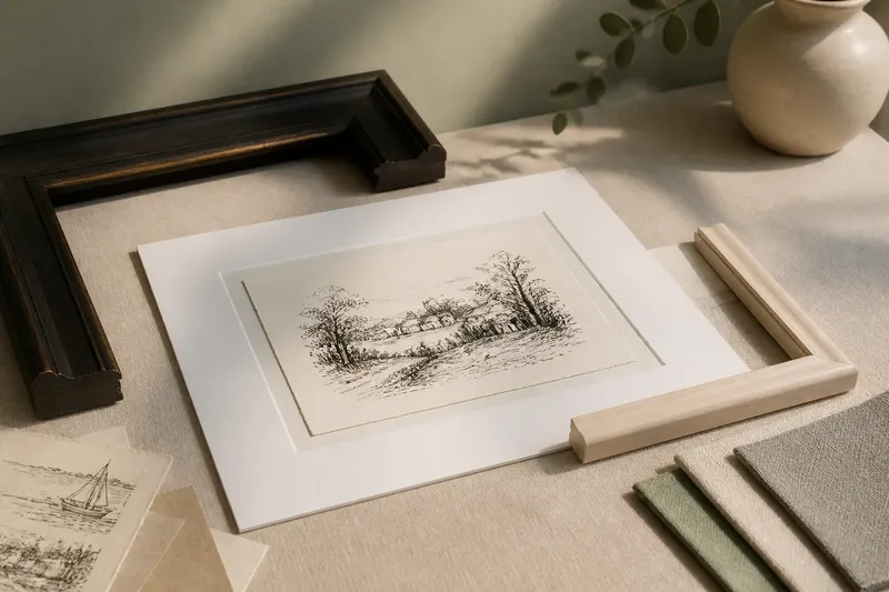
Subtle gradients, pale washes and muted colours can suit matte paper because sheen does not call attention to itself. The surface can help the image feel soft-spoken, allowing tonal transitions rather than the finish to draw attention.
Gloss can strengthen the impression of contrast and colour, though it may change the character of restrained work. A smoky grey may feel more dramatic with a reflective sheen; a delicate drawing may lose some of its quietness.
Imagine a small print of a foggy shoreline beside a bright window. If the glossy surface catches the window, the reflection may interrupt the low-contrast image; choosing matte could make the shoreline easier to read, while its tones may appear less punchy.
Gloss can sharpen the impression of dense detail
Fine lines, sharp edges and compact colour fields often benefit from the crisp, polished impression of gloss. It can make a photograph or digital illustration feel lively, particularly when the image depends on deep blacks, bright highlights or richly layered colour.
That effect is not the same as adding detail. A finish cannot restore information absent from the image file or print; it only changes how existing information is presented. If the picture is already busy, extra sheen may add another visual element rather than making the composition clearer.
For detailed work, compare the same print at the intended viewing distance. Close inspection can make surface qualities loom larger than they will in ordinary viewing.
The room determines how much reflection you can tolerate
A print opposite a window, beneath a bright pendant or near a desk lamp faces light from predictable directions. Gloss is more likely to show those sources as bright reflections. Matte can reduce their prominence, though strong light may still wash over the image and make it harder to see.
Consider the full viewing area, not just the wall. A glossy print might work well where light comes from behind the viewer or can be adjusted. In a busy shared room, matte may be less distracting as people move around and see the work from changing angles.
Use the lighting conditions you have, rather than judging a finish only under a shop’s even display lights.
The surface contributes to the image’s character
Matte can make a print feel restrained, tactile or close to a drawing on paper. Gloss can suggest polish, brightness or a more photographic presence. These impressions are not fixed meanings; they are visual effects shaped by the image, paper and surrounding light.
Ask what kind of attention suits the work. A glossy finish may make a saturated still life feel immediate, while matte may support a spare image whose appeal rests on open space and gentle transitions.
Pay attention to the paper as well as the coating. A textured matte sheet and a smooth matte sheet present an image differently, just as coated gloss paper differs from a slick transparent layer. Check the printer or paper maker’s guidance when handling or care requirements matter.
Choose a finish by checking the image, room and viewing position
Use the image’s tonal character, the room’s light and the usual viewing place to decide. Check each point below and follow the action indicated by what you observe.
- Check for reflections at the intended wall: if a window or lamp appears across important details, choose matte or change the print’s position; otherwise, keep gloss in consideration.
- Check whether the image relies on subdued tones: if pale washes or gentle transitions are central, compare matte first; if the image depends on vivid contrast, compare gloss as well.
- Check whether fine detail is easy to read at normal viewing distance: if gloss makes the image feel clearer without troublesome reflections, retain it as an option; if shine competes with the detail, choose matte or adjust the light.
- Check the print from the usual viewing angle: if reflections appear as you move across the room, try a different position or choose matte; if the image remains clear, either finish may suit.
- Check whether the surface texture suits the image: if texture distracts from smooth gradients, choose a smoother paper; if a tactile, subdued character supports the image, retain textured matte as an option.
- Check the paper and coating guidance: if the product calls for particular handling or cleaning, follow that guidance; if care details are unclear, ask the printer or paper maker before using a cleaning product.
Say you are choosing a finish for a brightly coloured street photograph, with a lamp near the intended wall. You compare matte and gloss samples there, look from the doorway and then from the place where you usually sit. The gloss sample reflects the lamp across a person’s face, while the matte sample keeps that detail visible but makes the colours feel less forceful; you decide to move the lamp and compare again, then choose gloss only if the reflection clears without making the picture harder to read.
Which matte or gloss questions help settle the choice?
Does matte or gloss show fingerprints more clearly?
Gloss can make smudges and fingerprints conspicuous because its reflective surface catches changes in sheen. Matte may disguise some marks, but its texture can be sensitive to rubbing or unsuitable cleaning, so handle prints by their edges.
Does matte always reduce glare?
Matte diffuses reflections, but it cannot prevent strong light from falling across a print and reducing its legibility. Check the actual wall and lighting rather than assuming matte will make every location glare-free.
Which finish suits a black-and-white photograph?
Either can work: gloss may emphasise deep blacks and crisp highlights, while matte can support softer tonal transitions and a quieter surface. Let the photograph’s contrast and the room’s reflections guide the choice.
Can a print be too glossy for a room?
Yes, if reflected windows or lamps repeatedly cover important parts of the picture from common viewing positions. Try changing the print’s position or the light’s direction before deciding that gloss itself is unsuitable.
For a final matte or gloss decision, look at the image from the place where it will be seen and let its visual character lead. Check the surface in the actual light: it should support the print’s tones and details without competing with them.